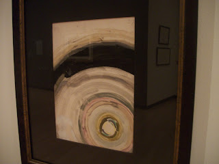
I recently visited several exhibits at the Burchfield Penney Art Center in Buffalo, NY. One of these was called Charles E. Burchfield: Oh My Heavens. It's theme is the work of Burchfield, which focused on outer space. The space was illuminated by track lights which gave off a soft light. The walls were primarily used to display the art, and all but one of them was white. The other wall was a semi-dark purplish gray color. This space contained a bench in front one one particularly large painting and a couple glass display cases. The viewer can freely move around this space, which is delineated by some walls and opens into other areas of the art center. The dark gray wall is what initially captures viewers attention. It has a painting on it as well as a chalk drawing which is a reproduction of one of Burchfield's drawings (which is hung on the opposite wall). The artworks are hung on the wall at eye-level, in different colored and styled frames. This exhibit had not only paintings, drawings, and some chalk and charcoal reproductions of his works, but some of his essays, one quote from him, and a magazine from the time of some of his works. The art all revolved around the theme that so interested Burchfield- outer space. The works are described in labels that are located next to them. This exhibit was relatively small, so the works were fairly close together. The painting shown below is Untitled (Haloed Moon) by Burchfield, from 1916. It is watercolor and graphite on paper, and approximately 7" x 11." The label next to it also has some relevant scientific explanations. This work has a bright white circle at the bottom right corner. Around it are circles of soft colors (browns, grays, yellows) as well as some black, which represent the night sky, as it is perceived, surrounding the moon. This is what the moon may look like in the night sky. The different rings of color create perceived lines which draw the eye outward from the moon and back towards it. The black is the color of the darkest value, and it contrasts greatly with the other colors, emphasizing the brightness of the light radiating from the moon. The subject matter appears two-dimensional. The entire canvas portrays an area of the sky close to the moon. Positioning the moon at a corner rather than in the center gives the sense of vastness and continuation of the lighted sky. The stark black balances the moon on the other side of the painting. The colors of the rings sometimes fade into one another as if they were moving. The moon's size indicates that this is a view of it from earth. This work reminds me of Van Gogh's Starry Night because of the rings of color around a heavenly body; it was painted twenty-seven years after Van Gogh's. I believe that the artist's intent was in part to express his awe at the beauty of this scene and the wonder of moonlight, which illumines such a vast sky.
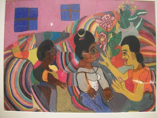
The artwork below is entitled My Mother, My Sister and me Talking on the Sofa (1963) by Bridgette Robinson, who was about twenty-two when she drew it. It is pastel on paper and seems less than 2' x 1.5'. It depicts three women sitting near each other in a room with pink walls and two small windows, which has some flowers and plants decorating it. It is not realistic in the sense that it does not use true-to-life proportions, perspectives, or shapes. The artist uses many bright, bold colors. The three women are in the foreground and some of their gestures are clearly portrayed. They are the largest of the subjects, so they are emphasized Wavy lines give a sense of movement. Certain portions of the drawing seem three dimensional, while others look two-dimensional. Space is not clearly defined, and the background seems to push forward due to the wavy lines and bright colors. The three women are somewhat centered and evenly spaced across the work, giving a sense of balance. Some colors are repeated and this unifies the work. This work reminds me of Picasso's Les Demoiselles d'Avignon in how shapes are used to non-realistically portray women. The eyes of these women are similar to Picasso's (in the work mentioned), which also hearken back to the eyes of ancient Egyptian art. The colors of this work remind me of expressionist works such as Matisse's The Joy of Life. The artists probably uses color to communicate the happiness she feels and the fun she has during conversations like these with her mom and sister on the couch.
This drawing is part of an exhibit called Disclosure - Women of the Burchfield Penney Collection. The theme of this exhibit is women in the world of art. Mostly works of women artists are featured. Here again track lights are used, resulting in a soft light. This space is surrounded by walls, but it also opens into other areas of the art center. There are a few striking features of this space. One is a movable wall positioned right at the entrance of the exhibit area, on which is hung a large painting featuring a woman. Above this painting is the name of the exhibit in large lettering. This painting welcomes viewers and gives them a sense of what they are about to see. Another striking design feature is that forming an implied circle in the center of the space are a series of displays. Most of them are glass display cases with spotlights shining down on them. One display is on the back of the movable wall mentioned before; it is a quilt made by a female artist. Under the quilt is a sculpture of sorts by another female artist. These works that form a circle give the center of this space more interest and functionality. Otherwise, the rest of the works are hung on the walls. The walls of this room are a dark medium gray color, and the works hung on the walls have, again, frames of various colors, shapes, and designs that complement the works. These frames are simple enough to not distract viewers from the artworks themselves. The display cases are black and white, and all look uniform. The works in this exhibit include sculptures, paintings, and fiber art. This space is somewhat large, but it does not require that much movement to view everything. The works in the center are spaced apart enough to create plenty of space to easily walk around them. These works have descriptions next to them as well as handwritten responses on papers from visitors to the exhibit.
A third exhibit I visited was called Illusion/Delusion after the sculpture (shown below) by that name by Ben Perrone from 2009. This space is larger with higher ceilings which accommodate this work, which is twenty-four feet high. This exhibit also includes paintings, photographs, display cases with memorabilia and other items, and a video playing on a flat-screen television on the wall. The walls are a light gray color. There is a bench facing the large sculpture. Nothing hinders viewers from walking up to and, in a way, inside of the sculpture or from touching it, since it was originally meant to be touched and moved. There is quite a lot of space around the sculpture with nothing else in it, which emphasizes the sculpture. The video that continuously loops and plays as well as a sign on the wall explain more about the sculpture. It is made of 4300 small, black paper bags which are hung by clear fishing line (I believe). A spotlight under it shines upward and helps viewers better see the space between each hanging column of bags, although the center of the sculpture is still quite dark. This sculpture forms an inverted pyramid which is given its shape by implied lines of bags, both rows and columns. Standing under it and gazing upward provides a different view. The black of the bags contrasts with the white walls behind the sculpture. This sculpture takes up a lot of space. It has texture in that the paper bags are crinkled. It is movable. It is unified- the bags are strategically hung and there are not many materials used. The video explains that the bags originally would have each held a piece of paper with the name of one soldier who has died in the Iraq war. The artist originally intended the bags to be hung in lines that would cover an entryway to a dark room so that visitors to the exhibit would have to push the lines of bags out of their pathway to enter the room. The bags symbolize lives of real soldiers. They take up a lot of space, reminding viewers that many have given their lives.
The next two pictures are of another exhibit and reveal the design of its space.
Visiting this art gallery with the primary purpose of analyzing the curators' use of space, architecture, organizational techniques, and display elements was a unique experience. If I had not specifically been considering these elements of design, I probably would not have noticed or appreciated them nearly as much. The work of the curator certainly is very important. He or she exercises a lot of influence over the experience that visitors will have and the perceptions they will come away with.


No comments:
Post a Comment