Friday, August 9, 2013

Self-Portrait Experiment

 Selfportrait
                                               Marianne von Werefkin
                                                                                                              painting                                         
                                                                         1910
            Staedtische Galerie im Lenbachhaus Kunstbau


 Self-Portrait
                                                              Vincent van Gogh
                                                                    Oil on canvas
                                                                                1889
                                                                    57 x 43.5 cm
                         National Gallery of Art, Washington, D. C.

 Self-portrait with Skeleton
                                                                                            Lovis Corinth
                                                                                            Oil on canvas
                                                                                                       1896
                                                                                              66 x 86 cm
                                           Staedtische Galerie im Lenbachhaus Kunstbau

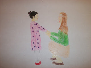
 Self-portrait
                                                                                  Katherine Brown
                                              colored pencil, crayon, marker on paper
                                                                                                   2013
                                                                                            4 x 5.5 in.


I enjoy the bright, bold colors of the first self-portrait above by Marianne von Werefkin.  I like how van Gogh's self-portrait that I selected has wavy, seemingly radiating lines similar to those in some of his other works.  I like the irony of the self-portrait by Lovis Corinth shown above- it shows, presumably, how he looked at the time the painting was done and how he might look after death.

For my self-portrait I used crayon, colored pencil and marker because I am studying to be an elementary school teacher, so these media have been and will continue to be a part of my life.

It took some contemplating to decide what my pose should be and whether anyone else should be in my self-portrait.  I knew I wanted to demonstrate that I love to help others, especially children.  Looking at the works shown above helped me decide that I did want to use color, because I think it communicate liveliness.  They also inspired me to reveal some aspects of my personality.  The one crayon I was using was rubbing off a strange dark pigment, so I had to look for another similar one.  I also found a picture to guide my drawing, since I am not skilled at drawing from memory.

My portrait hopefully reveals my love for children and desire to relate to and help them.

In my drawing, colors help to distinguish shapes.  Simple lines hint at an elementary skill level, a child-like quality.  I wanted the drawing to look like it could have been done by a child.  The two figures are balanced on either side of the center of the work.  There is an implied line created by their glances which meet.  The clasped hands are emphasized as they are in the center.  

I enjoyed attempting to portray my personality and goals in a self-portrait.  I enjoy working with the materials that I used.

My drawing could have been more carefully executed had I had more time.


Practicing Working As an Art Critic

     I recently viewed several art exhibition projects.  A few of the titles are With Life, Comes Death, Comics, The Visions Through Faith, Nature of the World, and Nature.  I chose to write an article critiquing Nature by Britten Walker (rather than choosing any of the others) for a few reasons.  First, I am personally interested in art that is related to nature.  Second, I had confidence that I could write about this theme, since it is familiar.  I was not at all confident that I could write on the topic of comics, in contrast.  Third, in perusing these exhibits I found that Nature had some excellent commentary accompanying the works, that would inspire my writings about it.
     In writing an article about this exhibit, as though I was an art critic, I had a few challenges.  I was uncertain of how to organize my thoughts.  I had to experiment with this as I went along.  I wanted to make the exhibit or gallery intriguing to potential viewers in what and how I wrote, so I carefully selected certain descriptions and sought to write in an engaging manner.
     It was a bit uncomfortable to point out the flaws of the exhibit.  I recognized, though, that this information can be helpful both to its creator and potential viewers.  I would appreciate a similar critique of my work for this reason- so I could improve it and learn from others who have more knowledge.
     I would give my completed article an 8 (on a scale of 1 to 10), since it is well done, yet it lacks some of the experience and expertise that a true critic can offer readers.
     This project was enjoyable in that it challenged me to write in a way that I have not, since I had to think primarily about art in doing so and act as an art critic.

Wednesday, August 7, 2013

Art Criticism

     In the video Greenberg on Art Criticism: An Interview by T. J. Clark, from “Films on Demand” I heard firsthand from art critic Clement Greenberg about his work.  He explains that, in his view, the most important component of a critique of a visual artwork is the value judgment of the work.  This judgment is not based on personal beliefs or preferences but simply on the quality of the work.  He does not believe that there are any standards in the visual arts to which new works should be held.  Rather, he believes that if an artwork is perceived as beautiful or creative, for example, then it is worthy of praise.  Art ought only be relevant to be “good.”  He also does not believe that a critic needs to have a lot of knowledge of art history in order to judge a recent work.  He also mentions that good art is made when an artist puts himself fully into his work.
     The video The Colonial Encounter: Views of Non-Western Art and Culture (from “Films on Demand”) has several examples of inappropriate art.  The video gives an overview of the exhibits from the 1900 Paris World Fair.  The fair was divided up into exhibitions representing various countries.  Two of these exhibits, those that represented Algeria and Dahome, used visual art in a way that misrepresented these peoples.  There were photographs of nude men and women in the Dahome exhibit that were supposedly used in a scientific way- certain features of the body were measured in order to determine the intelligence levels of the individuals pictured.  Yet, these photos were very evocative and the subjects did not seem happy to be photographed in this way.  This exhibit also had images of the Dahomans being very violent towards one another.  This was probably meant to foster attitudes in viewers that the French take-over of this region was for the benefit of the Dahomans.  In the Algerian display, belly-dancing  was seen in many images, giving the idea that this practice held greater importance in this country than it did in actuality.
     The first video mentioned helped me to consider how I might go about critiquing the artwork of my peers for the project I am working on.  I will keep cultural relevance in my thinking.  The second video reminded me of the importance of respecting the individuals portrayed in art.

     The first video gave me insights into the ways some art critics think and how they come to their conclusions.  The second taught me that the processes of the creation of artworks and their ultimate uses should be considered when critiquing them.

Saturday, August 3, 2013

Acting as a Curator

I just finished a project using Microsoft Powerpoint, where I created an art exhibition entitled Motion & Movement.  I chose this for my theme and title, since methods for demonstrating motion in art is intriguing to me.  I selected and organized 15 works into a logical, enjoyable presentation of varied works of art (including architecture, sculpture, painting, and video).  These artworks exemplify the following: the use of line and other elements and principles of art to give the idea of movement, works that require the movement of viewers for a full appreciation of them, works that document the movements of the artist, historical movements and the movement of time.  I used the ArtLex website, Google, and Bing to locate the works.  I selected the majority of my works from among those referenced in Living with Art, 10th Ed. by Mark Getlein, since I have been studying these and it is important for a curator to be familiar with the works in her exhibit.  This was a valuable exercise as it gave me the opportunity to explore an interest of mine and to think about the artworks I have studied in terms of themes that connect them.

Thursday, August 1, 2013

The Work of the Curator

     The following videos from “Films on Demand” all relate to the work of art gallery staff such as curators and directors: The Lowdown on Lowbrow: West Coast Pop Art, Displaying Modern Art: The Tate Approach, Bones of Contention: Native American Archaeology, An Acquiring Mind: Philippe de Montebello and The Metropolitan.  Below I have briefly described each.
     The first video mentioned above introduces viewers to what has been referred to as “Lowbrow” art or Pop Surrealism.  These artworks might be rejected for display by renowned art galleries due to their subject matter or styles.  They often contain images from pop culture and can have a lot of nudity.  Lowbrow art is designed to appeal to the carnal desires of viewers.  One main purpose for its display in galleries is to attract like-minded people who can enjoy this social scene.  Some Lowbrow art has become very well known and is considered fine art and has been displayed in some well-known art galleries.  Much of it, though, is displayed in small, privately owned galleries since other galleries will not accept it.
     The second video describes the unique approach that the Tate Gallery takes in displaying their art.  The gallery has four main areas, each representing a category such as “landscape.”  This is a very different approach than the traditional one, used by MoMA for example, where art is placed in chronological sequence, according to style.  There have been criticisms of Tate’s approach, such as that this may cause viewers to read more into a work (based on the category it is grouped under) than the artist would have intended.  Yet, that is not necessarily the case.  The video points out that curators seek to organize rooms and works in order to create attention-getting scenes and that art can be enjoyed without a lot of background knowledge about works.
     The third video provides some historical background to the Graves Protection and Repatriation Act of 1990.  This act required museums to return bones of Native Americans to their original tribes.  Some scientists were concerned that this would mean a great loss of important resources that could be studied to find cures for disease or information about migration patterns, for example.  Some Native Americans stressed to the museums that they wanted the bones returned immediately.  One tribe, the  Omaha, decided to allow the University of Nebraska to study the bones of their ancestors before returning them for reburial.  The study uncovered some valuable information that the Omaha were grateful to receive.  This video reminds viewers of the dilemmas that can arise in working with artifacts and determining who has the right to do what with them.
     The fourth video provides a behind-the-scenes look at how The Metropolitan, under the direction of Philippe de Montebello, expanded their art collection.  Curators had to present a work before a committee, who would vote on which works should be purchased.
     The first video relates to my creation of an Art Exhibition slideshow in that my project will be an electronic, online “gallery” of sorts, comparable to a small gallery used to display Lowbrow art.  This sort of presentation allows for the public display of art online.  The second video inspired me to come up with creative ways of organizing art in a display.  The third challenged my notions of what art is (photos of items such as bones may offend some).  The fourth video gave me some ideas about criteria for selecting works for my display.  These videos were helpful  and relevant to this project.
      

Saturday, July 27, 2013

Cubism and Matisse & Picasso

     Two videos from “Films on Demand,” The Impact of Cubism and Matisse and Picasso, gave me a better understanding of these topics, which is why I chose to watch them.
     The first video analyzes the following works of art from this movement: The Breakfast Table by Juan Gris, Sad Young Man on a Train by Marcel Duchamp, Champ de Mars by Robert Delaunay, Electric Prisms by Sonia Delaunay, An Englishman in Moscow by Kazimir Malevich, and Farewells by Umberto Boccioni.  Juan Gris worked for a time with Picasso, and he incorporated some collage elements into his paintings.  Cubist works often use dull colors (grays, browns, blacks).  Cubism was employed around the time of the World Wars, so the theme of turmoil can sometimes be picked up in these works.  Movement, especially movement over time or in specific spaces, is very important in the relatively few works created by Marcel Duchamp.  Robert Delauney’s work mentioned above allows viewers to experience the Eiffel Tower from a variety of viewpoints simultaneously.  It is described in the video as “dizzying.”  Space is used uniquely in cubist works in that foreground and background can blend into one another.  Sonia Delaunay uses more bright, bold colors in Electric Prisms.  She was considered avant garde.  This particular work seems to be more abstract than cubist since its subject, circular forms of a variety of colors, does not seem to represent anything in life as Cubism does.  Cubism reduces objects to their most basic forms.  The video explains that An Englishman in Moscow uses Cubist style without its content being Cubist.  The reasoning behind the subject matter is very difficult to understand.  Farewells is a good example of the Cubist practice of dissembling and reassembling an image.
     The video Matisse and Picasso describes the lives of both men and their work.  It also explains the relationship that they had.  They were not too far apart in age and created their art around the time of World War II.  They lived in Europe and were both prominent artists.  They shared some interests and subject matter for their works, such as nude women.  In other regards, they were opposites.  Matisse considered himself to be somewhat religious, while Picasso was an atheist.  Matisse kept his works free of the disturbing or troubling, while Picasso included some of these elements.  Matisse used many sitters, whereas Picasso usually did not.  Picasso was a Cubist, while Matisse was a fauvist.  The video states that Picasso created the first collage in 1912 when he used a scrap of cloth as part of an image of a chair.  Sometimes one created a work in response to a work done by the other.   The works of both tend to reduce subject matter to simpler forms.  They spent time visiting one another, especially towards the end of Matisse’s life. 

     Our text, Living with Art, 10th Ed. by Mark Getlein, introduces Cubism and fauvism.  These videos give a more complete picture of these styles.

Burchfield Penney Art Center Visit

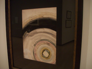
I recently visited several exhibits at the Burchfield Penney Art Center in Buffalo, NY.  One of these was called Charles E. Burchfield: Oh My Heavens.  It's theme is the work of Burchfield, which focused on outer space.  The space was illuminated by track lights which gave off a soft light.  The walls were primarily used to display the art, and all but one of them was white.  The other wall was a semi-dark purplish gray color.  This space contained a bench in front one one particularly large painting and a couple glass display cases.  The viewer can freely move around this space, which is delineated by some walls and opens into other areas of the art center.  The dark gray wall is what initially captures viewers attention.  It has a painting on it as well as a chalk drawing which is a reproduction of one of Burchfield's drawings (which is hung on the opposite wall).  The artworks are hung on the wall at eye-level, in different colored and styled frames.  This exhibit had not only paintings, drawings, and some chalk and charcoal reproductions of his works, but some of his essays, one quote from him, and a magazine from the time of some of his works.  The art all revolved around the theme that so interested Burchfield- outer space.  The works are described in labels that are located next to them.  This exhibit was relatively small, so the works were fairly close together.   The painting shown below is Untitled (Haloed Moon) by Burchfield, from 1916.  It is watercolor and graphite on paper, and approximately 7" x 11."  The label next to it also has some relevant scientific explanations.  This work has a bright white circle at the bottom right corner.  Around it are circles of soft colors (browns, grays, yellows) as well as some black, which represent the night sky, as it is perceived, surrounding the moon.  This is what the moon may look like in the night sky.  The different rings of color create perceived lines which draw the eye outward from the moon and back towards it.  The black is the color of the darkest value, and it contrasts greatly with the other colors, emphasizing the brightness of the light radiating from the moon.  The subject matter appears two-dimensional.  The entire canvas portrays an area of the sky close to the moon.  Positioning the moon at a corner rather than in the center gives the sense of vastness and continuation of the lighted sky.  The stark black balances the moon on the other side of the painting.  The colors of the rings sometimes fade into one another as if they were moving.  The moon's size indicates that this is a view of it from earth.  This work reminds me of Van Gogh's Starry Night because of the rings of color around a heavenly body; it was painted twenty-seven years after Van Gogh's.  I believe that the artist's intent was in part to express his awe at the beauty of this scene and the wonder of moonlight, which illumines such a vast sky.


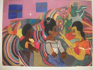
The artwork below is entitled My Mother, My Sister and me Talking on the Sofa (1963) by Bridgette Robinson, who was about twenty-two when she drew it.  It is pastel on paper and seems less than 2' x 1.5'.  It depicts three women sitting near each other in a room with pink walls and two small windows, which has some flowers and plants decorating it.  It is not realistic in the sense that it does not use true-to-life proportions, perspectives, or shapes.  The artist uses many bright, bold colors.  The three women are in the foreground and some of their gestures are clearly portrayed.  They are the largest of the subjects, so they are emphasized  Wavy lines give a sense of movement.  Certain portions of the drawing seem three dimensional, while others look two-dimensional.  Space is not clearly defined, and the background seems to push forward due to the wavy lines and bright colors.  The three women are somewhat centered and evenly spaced across the work, giving a sense of balance.    Some colors are repeated and this unifies the work.  This work reminds me of Picasso's Les Demoiselles d'Avignon in how shapes are used to non-realistically portray women.  The eyes of these women are similar to Picasso's (in the work mentioned), which also hearken back to the eyes of ancient Egyptian art.  The colors of this work remind me of expressionist works such as Matisse's The Joy of Life.  The artists probably uses color to communicate the happiness she feels and the fun she has during conversations like these with her mom and sister on the couch.
     
This drawing is part of an exhibit called Disclosure - Women of the Burchfield Penney Collection.  The theme of this exhibit is women in the world of art.  Mostly works of women artists are featured.  Here again track lights are used, resulting in a soft light.  This space is surrounded by walls, but it also opens into other areas of the art center.  There are a few striking features of this space.  One is a movable wall positioned right at the entrance of the exhibit area, on which is hung a large painting featuring a woman.  Above this painting is the name of the exhibit in large lettering.  This painting welcomes viewers and gives them a sense of what they are about to see.  Another striking design feature is that forming an implied circle in the center of the space are a series of displays.  Most of them are glass display cases with spotlights shining down on them.  One display is on the back of the movable wall mentioned before; it is a quilt made by a female artist.  Under the quilt is a sculpture of sorts by another female artist.  These works that form a circle give the center of this space more interest and functionality.  Otherwise, the rest of the works are hung on the walls.  The walls of this room are a dark medium gray color, and the works hung on the walls have, again, frames of various colors, shapes, and designs that complement the works.  These frames are simple enough to not distract viewers from the artworks themselves.  The display cases are black and white, and all look uniform.  The works in this exhibit include sculptures, paintings, and fiber art.  This space is somewhat large, but it does not require that much movement to view everything.  The works in the center are spaced apart enough to create plenty of space to easily walk around them.  These works have descriptions next to them as well as handwritten responses on papers from visitors to the exhibit. 

A third exhibit I visited was called Illusion/Delusion after the sculpture (shown below) by that name by Ben Perrone from 2009.  This space is larger with higher ceilings which accommodate this work, which is twenty-four feet high.  This exhibit also includes paintings, photographs, display cases with memorabilia and other items, and a video playing on a flat-screen television on the wall.  The walls are a light gray color.  There is a bench facing the large sculpture.  Nothing hinders viewers from walking up to and, in a way, inside of the sculpture or from touching it, since it was originally meant to be touched and moved.  There is quite a lot of space around the sculpture with nothing else in it, which emphasizes the sculpture.  The video that continuously loops and plays as well as a sign on the wall explain more about the sculpture.  It is made of 4300 small, black paper bags which are hung by clear fishing line (I believe).  A spotlight under it shines upward and helps viewers better see the space between each hanging column of bags, although the center of the sculpture is still quite dark.  This sculpture forms an inverted pyramid which is given its shape by implied lines of bags, both rows and columns.  Standing under it and gazing upward provides a different view. The black of the bags contrasts with the white walls behind the sculpture.  This sculpture takes up a lot of space.  It has texture in that the paper bags are crinkled.  It is movable.  It is unified- the bags are strategically hung and there are not many materials used.  The video explains that the bags originally would have each held a piece of paper with the name of one soldier who has died in the Iraq war.  The artist originally intended the bags to be hung in lines that would cover an entryway to a dark room so that visitors to the exhibit would have to push the lines of bags out of their pathway to enter the room.  The bags symbolize lives of real soldiers.  They take up a lot of space, reminding viewers that many have given their lives.

The next two pictures are of another exhibit and reveal the design of its space.

Visiting this art gallery with the primary purpose of analyzing the curators' use of space, architecture, organizational techniques, and display elements was a unique experience.  If I had not specifically been considering these elements of design, I probably would not have noticed or appreciated them nearly as much.  The work of the curator certainly is very important.  He or she exercises a lot of influence over the experience that visitors will have and the perceptions they will come away with. 


Monday, July 22, 2013

Reviews of Two Art-related Videos

     The title of the video, The Great Wave (from "Films on Demand"), captured my attention.  It focused on Hokusai's print by this name.  It is one print in a series by this artist called 36 Views of Mt. Fuji, done in the early 1800's.  Mt. Fuji is an important image in Japanese art, as it is the highest mountain in Japan and is awe-inspiring.  The perspective of the mountain in this particular print is exceptional.  It almost looks like another wave in the distance.  The boaters in the drawing are possibly about to perish in the great wave, so this is a dramatic, fearful setting.  The image is somewhat symbolic, which is evidenced in part by the claw-like ends of the curled waved which seem to be about to snag the boaters.  The video provides more details about the importance of Japanese prints as art in this time period.
     Our text, Living with Art, 10th Ed. by Mark Getlein features a few examples of Hokusai's work and discusses his life.  It does not examine The Great Wave, so the video provides a fuller analysis of the work of this great artist.
     African Art: Legacy of Oppression is another video from "Films on Demand."  I wanted to understand the meaning behind this title.  The video comments on the irony of a large collection of art from the central Africa being housed at the Belgium's Tervuren Museum, since Belgians colonized this region in the late 1800's and brutalized some of the people.  The art is as varied as the many cultures it represents.  It includes some masks.  These were used for a variety of purposes such as supposedly interacting with the dead, attempting to scare Westerners, and to teach important values such as respect for disabled and sick individuals.
     Much art from Africa exemplifies the fact that non-representational art can be used to communicate important ideas, emotions, and values.  Our text comments that "the arts of Africa challenge us to expand our ideas about what art is, what forms it can take, what impulses it springs from, and what purposes it serves," (Getlein, 418).  The text also mentions another instance where Westerners took African art back with them after attacking one area (Getlein 419).  It explains about some types of masks used in masquerades.  The video provides a close look at some artwork from Africa that the text does not feature.  
   

Thursday, July 18, 2013

An Experiment With Drawing

     The hand on the right I drew using my left (non-dominant hand).  The hand on the left I drew with my dominant, right hand.  I was glad to draw my hand because I find it very difficult to draw something that I do not have in front of me.  The subject matter was a little boring, though.  I could have given more detail by shading, but the main point of this experiment was to experience the differences in drawing with a dominant and a non-dominant hand.
     I used pencil rather than charcoal, because charcoal smears easily.
     It was nearly impossible to control the fine movements of my non-dominant hand.  Drawing with this hand produced unwanted waviness in the lines.  I found it was especially difficult to control the movements if I attempted to draw a line from the bottom of the page to the top (it was a little easier to control my hand if I drew from the top down).  I also found that it was more difficult to see the paper as I was drawing.
     The drawing done with my dominant hand has smoother lines and more accurate details and proportions.  It was nearly impossible to create the fine details using my non-dominant hand, because I couldn't get it to move the way I desired.  Yet, the final picture done with my non-dominant hand is not all that different that the other.  This makes me think that with practice I could become almost and skilled with using my left hand as I am with using my right.
     I would consider using my non-dominant hand in the future in order to strengthen the muscles and develop further my hand-eye coordination.  

Diego Velazquez and Leonardo da Vinci

     First, I chose to watch the film Leonardo da Vinci: The Mind of the Renaissance (from “Films on Demand”) because I wanted to understand the significance of the phrase “the mind of the Renaissance.”  Second, I chose the film Velazquez (“Films on Demand”) because I wanted to learn about an artist from another country and culture than Leonardo da Vinci.
     I have summarized some key concepts I learned from both:  Leonardo da Vinci lived in the second half of the 15th century and early 16th century (whereas Velazquez lived in the beginning of the 17th century).  Da Vinci was skilled as a mathematician, architect, engineer, musician, and scientist, in addition to being a gifted artist.  The title “Mind of the Renaissance” refers to da Vinci’s brilliance in a variety of subjects.  He lived in Italy during the Renaissance.  He did not think the fine arts should be considered separately, apart from the “mechanical” arts.  He was especially skilled as using light in his paintings.   He believed the job of the artists was to represent man and the motions of his soul.  He studied the human body through dissection of corpses.  He identified 11 elements used to create a work of art (which included light, color, and form), many of which are still considered the basic elements and principles of art.  Many of the figures in his works have the same subtle smile.  Da Vinci many times created works, which he was commissioned to make, but never gave them away.  Two works for which he is very well known are The Last Supper and the Mona Lisa
     Velazquez was born and lived most of his life in Spain.  He was a painter in the court of King Phillip IV for many years and was a friend of the king.  He painted him several times.  His painting style has been called Baroque, and yet it is quite unique.  As the video points out, his works are not showy or artificial.  His figures are realistic but they all seem to have calm expressions.  He does not portray landscapes (as backgrounds) exactly as they appeared, but he gives the basic sense of the landscape.  He does not use many bright colors.  The lack of detail or color seems to emphasize the souls of the figures rather than their appearance.  He is well known for his paintings of the court jesters who worked for the king.  He also did many equestrian portraits. 
     The text (Living with Art, 10th Ed. By Mark Getlein) calls da Vinci and Michelangelo the “outstanding figures” of the High Renaissance (371).  It explains that the term “Renaissance man” came to be used because of men like these who were so talented in a variety of skills.  It also mentions that da Vinci studied human proportions and that his math skills are seen in his use of perspective.  Getlein explains that many of his works were unfinished (371).  He explains that da Vinci’s portrayals are often not realistic but have religious meanings (372). 
     The text calls Las Meninas Diego Velazquez’s “masterpiece” (396).  Getlein explains that he “uses light to create drama and emphasis” (396).  He comments on the “theatricality” of this work, which is an example of Baroque art (397).

     These videos taught me more extensively about the lives and work of these two artists than the text.

Saturday, July 13, 2013

Review of 2 Art Videos

         The video More Human Than Human (from the “Films on Demand” website), selected by our professor, makes the point that quite possibly the finest sculptures of humans ever created were those made by the Greeks in the 5th or 4th centuries B.C.  The Riace Bronzes are used as examples.  These male, athletic figures were unrealistic in the sense that certain muscles were overly pronounced and some muscles were tensed while others were relaxed, which cannot occur naturally.  These sculptures glorified toned bodies.  This was linked to cultural and religious beliefs commonly held at that time. Throughout history as cultures change, art, and specifically the portrayal of the human body, changes.  Different features of the body are focused upon or exaggerated at different times.  The way that ancient Egyptian art portrayed the body remained basically unchanged for about 3,000 years.  This portrayal reflected the cultural values of order and consistency.
     Both the text, Living with Art, 10th Ed. by Mark Getlein, and the video mention the Female Figure from Willendorf, with its exaggerated features.  Getlein concludes (referring to the many female statuettes found in various parts of the world and dated to, what is referred to as, the Paleolithic period), “The most we can say is that they testify to a widely shared belief system that evolved over time,” (323).  The text also teaches about the art of ancient Egypt and the Riace bronzes.
     This video is helpful in giving an overview of how the human body has been portrayed in art by various cultures through history and analyzing possible reasons for the drastic differences in these portrayals.  This subject is not as explicitly addressed in the text, so the video is an excellent complement to it.
     I hoped that by watching the video Late Gothic Art and Architecture: England, 1400-1547 (from the “Films on Demand” website) I would expand my understanding not only of the art of this time but also the history.  I was not disappointed.  During this time period England was involved in a couple of wars.  Yet, members of society were still very concerned to create and own art.  It was considered the duty of kings to own and display great works of art.  Many kings built grand churches for their personal worship.  Catholicism was the dominant religion in England.  Much of the art was associated with this religion.  Local churches were also very ornately decorated and contained much art used for worship such as sculptures, stained glass, and illuminated texts.  Localities would sometimes compete to have the grander church.  Parishioners considered it meritorious to give towards these building projects.  With the Protestant Reformation, though, came iconoclasm, and much of the gothic art of this time was destroyed.
     The text describes the Gothic period of art, which was from about 1200 A.D. until the 15th century (Getlein, 357).  It mentions that many churches were built at the time.  It explains, whereas the video does not, the beginnings of Gothic architecture as well as the progression of Gothic sculpture (Getlein, 359-361).  Yet, the video provides more details about the history of this time.
   

Saturday, July 6, 2013

Two Videos on Architecture

     The video Architecture: The Science of Design (from the website Films on Demand) discusses the structure and purposes of skyscrapers, technologies used to regulate the temperature, humidity, electricity, and security of buildings, and the formation and uses of concrete.  The weight of skyscrapers (both from its building materials and all that they hold) is borne by the foundation.  Because they are many stories high, they move more in the wind than shorter structures.  They also cause very strong currents of wind to blow even at ground-level, which can make walking around these structures troublesome.  Skyscrapers allow for more people to dwell in concentrated areas.  Their construction became possible due to the discovery of steel’s potential as a building material.  Concrete is also very important in their construction, especially for their foundations.  Many environmental factors must be considered before a skyscraper in constructed, including the amount of pollution in the air in the area.
     Concrete is a very important building material, which allows for varied structural forms.  It was used by the ancient Greeks and Romans.  It can endure extremes of temperature.  Portland cement is widely used today, and it was invented in 1824, although other cements were used previously.  Often concrete must be reinforced with bars of metal (layered around metal bars) in order for it to be strong enough for certain uses.
     The video Imperial Rome, Ostia, and Portus: Ancient Architecture and Technology (also from Films on Demand) examined several structures from these locations, including the Pantheon,  insulae (which are similar to modern city blocks, surrounded on four sides by roads), and public baths such as the extremely large one at Carracalla.  The technologies used in building these often were borrowed from the Greeks and used in inventive ways.  The empire of Rome (which was the largest empire in the Western world at that time) had to have structures that would accommodate all its people.  The insulae were composed of buildings, which often had five stories.  The wealthier residents lived I the lower apartments where there was running water.  Local materials, such as the stone tufa, were often used in construction.  Sometimes buildings materials, such as the marble slabs for the columns of the Pantheon which came from Egypt, were imported from great distances to send the message that Rome’s power was far-reaching.  The Romans used arches, domes, vaults, coffering, thick walls for protection, relief sculpture, post and lintel construction, entablature, pediments, and large windows with glass (sometimes double-glazed for better insulation), to name a few techniques, in their construction.  Many structures were made of brick-faced concrete.  For structures like domes, they varied the aggregates used for the concrete so that the top of the dome was made of lighter-weight materials.  The interior of the great dome of the Pantheon represents a great accomplishment in architecture.  Historians are not quite sure how they accomplished the coffering.
     These videos, as well as the text Living with Art, 10th Ed. By Mark Getlein, address the importance of using the right materials for the right structures.  Some materials are better suited to certain structures and environments.  The text alludes to the use of structures for communicating messages, such as messages of power or prestige.  The video about Rome provides several examples of how architecture was used in this way even in ancient times.
     These videos both provide a more detailed understanding (than does the text) of some of the processes involved in creating architectural structures and the composition of some large structures. 
     I chose to watch the first video to gain a better understanding of the techniques involved in building.  I chose the second one to deepen my understanding of the architectural technologies employed by the ancient Romans.

References
Getlein, Mark. (2013). Living with Art. 10th Ed. New York: McGraw Hill.


Monday, July 1, 2013

Review of an Art Video

From the video Through the Eyes of the Sculptor I learned, for one thing, about the restoration of monuments by sculptors.  When a piece is restored it is removed and replaced with a new block of stone.  The sculptor looks at the old piece and copies or recreates it.  Sculptors must consider many things before beginning a work.  They should think about where the sculpture will be displayed (including the climatic conditions), what materials will be used to make it and, therefore, how fragile it will be, what impression do they want it to make or what feelings do they want it to evoke, etc.  The process of creating a marble sculpture includes many involved steps.  Often a clay miniature is made first.  From this a negative can be made (sometimes from silicon).  The sculpture may be cast in plaster before it is finally sculpted from  marble.  The sculpting of the marble is done by many expert artists, not just the artist who is ultimately creating the work.  I did not know that a team of people were involved in  creating a sculpture.

The artist who was the main subject of the video used modeling, casting, carving and assembling (which are all described in Living with Art, 10th Ed. by Mark Getlein [chapter 11]).  The text also introduces readers to various media used in sculpture, such as clay.  The video added to my knowledge by allowing me to watch some of the process of creating a sculpture.


Responding to Classmates

My thoughts related to Emily Beresford's BlogThe sculpture Pulsing Resolve by Jan Hewitt Towsley makes me wonder how the rainbow effect was achieved. I think Whisper Words of Wisdom by Barbara Fox is beautiful. I also enjoy works that are decorated with calligraphy. In reference to the painting High Falls by Phyllis Bryce Ely- it is interesting that I recently visited Niagara Falls, and the water going over the falls did actually appear that color green. I am not sure why.  Adam and Eve on West 57th Street by Thomas Insalaco is interesting to me in that it leaves viewers thinking about what Adam and Eve might think about what they are seeing and what the on-lookers would think about Adam and Eve.

Supurcell Productions' Blog posting entitled "AED 200 Elements and Principles" includes several photos to represent the elements and principles of art. One suggestion I have is that the proportion photo might be improved if there were a person or other object next to the fountain to help the viewer better understand its size. There is a person in the background, but if they were emphasized more I think that would be more visually interesting and better portray the concept of proportion.  The light (representing the element color) in the photo representing line (especially the red light) helps to reveal the continuation of the tunnel. 

Grace's Blog's photos, linked on her posting, "The Elements and Principles of Art and Design," accurately represent the elements and principles of design.  Her photo which represents color also includes an implied line, and her photo showing emphasis uses color to create the emphasis.  The elements and principles are combined in artwork.

Although I did not include it among my selections, I also was very impressed by the painting by Tauba Auerbach which looks like a crumpled piece of paper but is actually acrylic on canvas.  I actually looked at it from the side just to make sure the painted surface was smooth, because it looks so much like a 3D piece.  It really tricks the eyes.

The painting La Source de la Loue by Gustave Courbet is interesting to me.  It leaves me with the thought that although art can be used to realistically represent a scene, it is limited in the sense that only some part of a scene can be represented or sometimes even be seen by the artist. There is so much more to the scene that is hidden either from the artist, the viewer of the artwork, or both.

I also connect with the painting Dinamismodium un Cane al Guinzaglio (Dynamisiom of a Dog on a Leash) by Giacomo Bella since I have a dog and I enjoy walking her.  I know the feeling of running alongside a dog.  This piece reminds me of those feeling of being in  motion.

It was helpful to read about the experiences of my classmates as they completed these projects.  I realized that some struggled a bit with the same things that I had difficulty with.  I learned some new things about photography as well as interesting events and other art galleries in this area.  This gave me the opportunity to experience some other works of art as they did.

The comment about my photo for texture was very helpful- the leaf can be difficult to distinguish at first.  I could have tried to increase the light in this photo.


Friday, June 21, 2013

My Personal Logo


     Creating a personal logo was a fun challenge.  In the process I learned more about logos and their creation.  Logos should reflect the personality (likes and interests) of the person or company that it represents.  It should make use of the elements and principles of design in order to communicate a message and evoke the right feelings in the intended audience.  The most important aspects should be emphasized.  My design idea changed a few times before I even began sketching anything.  My ideas flowed, primarily, from my brainstorming and writing about my personal likes and interests.  I made use of color, balance, form, and implied and actual lines.  I used pencil to trace my design before coloring it with watercolors.  I used some red colored pencil and red watercolor for the cross.  The tip of the pencil is colored with pencil, but the rest of the design was colored with watercolor.  The most important discovery I made was that watercolor can be manipulated in the sense that water on a brush can be used to move the paint around and lighten the color after it has been applied.  I used this technique with the flower.  I consulted several resources before creating this logo.  The most significant thing I learned was from the book D.I.Y.: Design It Yourself, edited by Ellen Lupton.  In it, Mike Weikert writes, "Picture your favorite T-shirt...your fresh haircut, and the big green bowl you bought on eBay...Now, imagine taking these elements and distilling them into a single graphic representation that expresses your most distinctive characteristics," (109).  This statement greatly helped me decide on a design.  The video Graphic Design: What's in a Logo? (http://digital.films.com/play/5DY94N) was helpful.  The video Bottled Up: Repackaging the Brand (http://digital.films.com/play/6ZFKNR) was interesting but not particularly helpful for this assignment.  

References:
Lupton, Ellen. (Ed.). (2006). D.I.Y.: Design It Yourself. New York: Princeton Architectural Press.


Wednesday, June 19, 2013

Albright-Knox Visit

I took these photos at the Albright-Knox Art Gallery in Buffalo, NY and obtained the specific information on each artwork from the signs displayed by them.

1.     George Segal.  (American, 1924-2000).  Cinema, 1963.  Made of plaster, illuminated Plexiglas, and 
metal.  
        The sculpted man is about 6 feet in height.  The screen is about 6 feet tall and 5 1/2 feet wide.  Each letter seems to be over 1 foot high and about 9 inches wide.  
        This work of art caught my attention.  I saw it out of the corner of my eye, and I thought this was a real person.  It's almost as if the work of art is making itself.  It was fun to examine this piece.  The man looks quite life-like.  It made me wonder why this scene was given importance and replicated.  It was probably due to the impact of the cinema on the American society.  For decades the cinema has been a source of entertainment for the whole family.  It has given people of very different walks of life a shared interest and has gathered community members together.

2.     Andy Warhol.  (American, 1928-1987).  Mao Tse Tung, 1973.  Set of ten color serigraphs.  Edition of 250.
        Each of the 10 prints seem to be about 2 1/2 square feet in area. 
        I would like to know more about these prints which make up this one work.  Could the different colors represent Tse Tung's different moods or actions or differing opinions of him?  What is the significance of the squiggly lines that appear in different places and shapes in each print?  Do they represent his different thoughts or moods?  Why are the lips emphasized using different colors?  Is it to remind viewers of the words he spoke?  Were these prints modeled after a photograph?  The repeated images remind viewers of political propaganda.

3.     Andy Warhol.  Untitled.  From the portfolio Ten Works X Ten Painters, 1964.  Screen Print.  Edition 395/500.
       This print seems about 1 1/2 feet long and 1 1/4 feet wide.
       The sign near this print tells viewers more about this work.  It is based upon a photograph taken by Charles Moore in May, 1963 of the race riots in Birmingham.  This is an upsetting image that evokes strong emotions.  This work impacted me because it shows an actual event.  It is very similar to a photograph.  The African-American man is being bitten by a police dog.  Another police dog is lunging at him, and he is surrounded by police, one of whom is holding what looks like a club.  Other African Americans look on in sadness and concern.  One man, who seems to want to intervene on behalf of the surrounded man, is held back from doing so.  Even without much background information about this image, it still is upsetting.  It makes viewers wonder why all of this action taken against this man.  Was this injustice due to racial prejudice?    
4.     Nicholas Krushenick.  (American, 1929-1999).  Iron Butterfly, 1968.  Made of ten color screen prints on rag content board stock, edition 56/125.
        Each of the 10 prints seem about 2 1/2 feet high and 2 feet wide.
        I can identify with this artist, since I especially enjoy using bright, bold colors when creating art.  I also like to use simple shapes to create patterns.  This artist uses many bold, parallel lines, sharp angles, circles, and curves.  He only uses a few colors for each print, and he does not vary the value of these colors.  He used a vanishing point in one print to direct the eyes.  The bold, bright colors are what primarily captured my attention and interest.  One young girl was also admiring this work, possibly for the same reason.
5.     Anne Arnold.  (American, born 1925).  Charlie, 1969 and Charlotte, 1971.  Acrylic on canvas over wood.    
        The pig seems to stand about 2 1/2 feet off the ground, be 3 feet long, and 2 feet wide.  The cat looks about 4 1/2 feet high and 2 1/2 feet wide.
        I can relate to this artist in that I share her interest in animals.  These two sculptures somewhat emphasize the shapes of the cat and pig.  The cat has no tail, but otherwise these somewhat represent their actual shapes.  The coloring of these sculptures is also quite realistic.  The way the two are arranged is amusing.  I am not sure if this was the artist's vision or not, since they were completed in separate years.  The placement of this work in the museum also adds to the experience of it.  It is positioned at the top of a staircase, and it is a surprise to viewers as they come up the stairs.  It is also attention-getting since the animals are larger-than-life in scale.  When viewers walk around or past this scene, it is almost like walking past the encounter of these animals.  
6.     Eduardo Luigi Paolozzi.  (Scottish, 1924-2005).  Japanese War God, 1958.  Bronze.
        This sculpture is about 5 feet high and 8 inches deep.
        I would like to know more about this work.  What message might the artist have been trying to communicate?  Did the Japanese actually worship a god of war?  Was this symbolic of the artist's view of the Japanese's conduct in battle? What do the long, rectangular and other shapes that cover this image represent?  Are they the weapons of war or the wreckage left behind after war?  This piece has areas that look like broken down, hollowed out spaces.  The image seems to be walking or moving, persevering in his mission.  Does this communicate that the Japanese war god does not veer from his course, even if he is falling apart?


Friday, June 14, 2013

Creating a Value Scale and Color Wheel

     When I began to create the value scale, using charcoal, I thought it would be impossible to achieve the lightest colors.  I began with the darkest color (black) and gradually worked to the lightest.  I used a soft charcoal pencil for about 2/3 of the boxes.  I found that crosshatching produced an even color and also allowed for more coverage of the paper and darker values.  When I got to the lighter values, I no longer used crosshatching, but I moved the pencil in one direction only to keep the color light.  For the last few boxes, which had the lightest values, it occurred to me to rub thin layers of soft charcoal onto my fingertip (from a charcoal stick) and gently rub that onto the paper.  Other tools (such as a sponge) might have produced the same effect.  I do not believe I could have achieved the lightest values using the pencil, because it was too difficult to control.  It was not an even surface to glide across the paper, but a rounded one that made it difficult to apply the color evenly.  To achieve the darker values, I had to file my pencil several times to avoid uneven pressure on the paper.
     I realized, when creating my color wheel, it was important to mix equal amount of the different colors of paint to achieve the secondary color I needed.  I used two different brands of paint.  I believe this is the reason I could not achieve black and my secondary colors were not as intense as they should have been.
     I enjoyed working with the acrylic paint more than the charcoal, because I love to look at bright colors and I prefer the smoothness of the paint to the dry, gritty charcoal.  Charcoal can be used to achieve a variety of values, but that is not as enjoyable, for me, as working with a wide variety of colors.  Charcoal easily smears, so artists must be extra careful to avoid this. 
     My most important discovery, in creating these, was that it is important to use only one brand of paint for each work or art, so that colors mix to create the secondary colors desired.
     The videos, located at the following links, were both helpful:
The most surprising thing I learned (from Jared Bendis) was that the colors that so many experts consider to be primary (red, yellow, and blue) are not necessarily primary.  He used yellow, magenta, and cyan to create red and blue.  Yellow, magenta, and cyan combine to make black, whereas yellow, red, and blue combine to make brown.  For these reasons, he considers yellow, magenta, and cyan to be the true primary colors.

References
Bendis, Jared. (2008, June 13). Color Theory 2: Paint/Pigment Primary Colors.  The Truth!!!  Video posted
     to www.youtube.com


Saturday, June 8, 2013

Principes and Elements of Design/Photography Project

     Creating a Photobucket account (at www.photobucket.com) was simple.  It was a fun and challenging assignment to take 14 photographs and have each represent one principle or element of design.  I visited a park and gazed around myself for forms and locations that would work for these photos.  Sometimes an object around me quickly stood out in my thinking as a good subject for a photo.  Other times I had to search and analyze more before locating what would work.  It was difficult sometimes to set my camera to a setting that would capture an image with sufficient light.  It was cloudy when I took the photos.  A few of the photos came from locations other than the park, since I had taken a few at a different location prior to visiting the park and I did not find all of the subject matter that I desired at the park.  This exercise required me to consider the principles or elements of design to ensure that I had an adequate understanding of them.  It caused me to look at my surroundings in a different way- to consider the possible meanings that could be communicated by the images I was viewing and photographing.

browk53's Principles and Elements of Design album on Photobucket


Friday, June 7, 2013

Colors and Emotions


1.     According to Mark Getlein, in Living with Art, 10th Ed., “[C]olors are actually
components of light…and no object possesses color intrinsically,” (90-91).  The colors that we see are the colors that are reflected by the items we are viewing.  The colors that we do not see, when we look at an object, are the colors which are being absorbed by that object (Getlein, 91).  The primary colors, red, yellow, and blue “(theoretically at least)…cannot be made by any mixture of other colors,” (Getlein, 91).  Colors associated with fire, etc. (red, orange) are classified as “warm” and those associated with water and other things (green, blue) are called “cool” (Getlein, 91).  Colors have hue (a name based on the color wheel), value (“relative lightness or darkness” [Getlein, 92]), and intensity (level of purity, where great intensity means closeness to the color wheel and no other mixed in colors).  Pigments and lights of  different colors can be mixed.  Colors have relationships with one another.  Depending on their respective placements on the color wheel, they can seemingly intensify or balance one another, for example.


             Colors can evoke feelings and emotions in viewers.  Cool colors might evoke a feeling of cold, for example.  Depending on the context in which they are used, light colors (those of a light value) can bring to mind goodness and hope, and dark colors can remind viewers of evil and despair.

2.     I am most intrigued at why certain objects absorb some colors of the spectrum and reflect others.  Without a variety of colors in our world, we would not be able to see very clearly.  Colors form implied lines, by separating objects from one another and making them clearly distinct in our eyes.  This thought reminds me of the verse from Psalm 118:23 (NKJV), “This was the LORD’s doing; It is marvelous in our eyes.”

3.     The video entitled Color (http://digital.films.com/play/RJ8PAN) emphasizes that colors express ideas and evoke feelings.  Van Gogh used color in his painting, The Night Café, to express his great dislike of this ugly café and to evoke some of the distressing feelings and thoughts that one might have while in such surroundings.  Artists intend that the colors of their works evoke specific feelings in viewers.   These feelings give viewers a shared experience as they view the art.  Not all viewers will have the same emotional response to a particular work, though.

4.     The video Feelings: Emotions and Art (http://digital.films.com/play/8HLQ96) discusses several works of art by both Jacques-Louis David and Francisco de Goya, who lived during the Enlightenment.  The paintings of David often show heroic, beautiful-looking individuals.  The paintings seem to express that people have potential to do good and achieve great things.  David uses colors of lighter values quite extensively in his paintings.  The resulting perception of light evokes feelings of hope and thoughts of goodness.  De Goya, on the other hand, uses colors of dark value extensively.  This darkness intensifies the emotional impact of his often ugly, gory images.  The dark colors evoke feelings of dread, confusion, and hopelessness.  People seem to universally experience the emotions related above when thinking about certain light or dark colors.  Many seem to agree that darkness is related to evil and light to good.  This may be partly due to the fact that darkness is the absence of color and light is the source of all colors (Getlein, 90).

References

Getlein, Mark. (2013). Living with Art. 10th Ed. New